
The last few years have brought an explosion of tools built to support creativity, and an entirely new class of AI workflows that promise speed and scale. At first glance, this should make content creation easier for everyone, but we’re now witnessing the opposite.
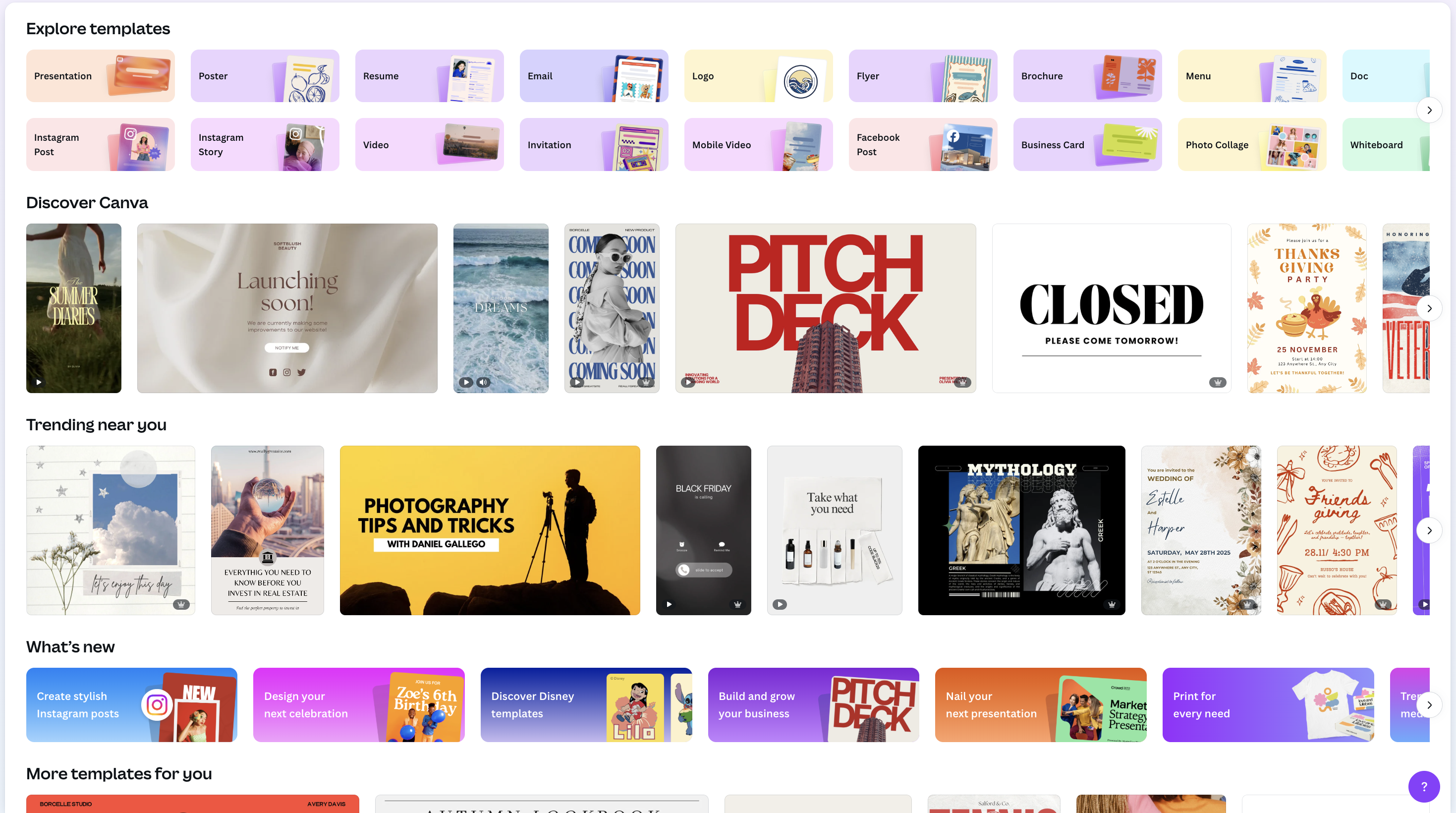
Most tools have embraced the belief that delivering more equals a necessary flexibility: more templates, more layouts, more styling variations, more ways to adjust the same component over and over again. But what actually happens is that non-designers end up navigating a sea of micro-decisions that don’t make their story stronger and often make it harder to recognize the brand it represents.
What teams don’t need is an ever-growing set of creative knobs to turn.
They want videos, images, and other content that looks good – without the need to become expert designers themselves.
More Choice Means More Chaos
AI has made it possible for anyone to generate content at remarkable speed. You can create ten variations in minutes, spin up an entire website in an afternoon, or produce a complex walkthrough without touching a design tool. But the ease of production has introduced a new layer of confusion. When a tool presents fifty choices, the user has no reliable way to distinguish which one supports the story and which one subtly undermines it.
Most GTM professionals don’t want to spend their time playing with spacing, evaluating color balance, or choosing between nearly identical layouts. They want the confidence that whatever they make will look polished and intentional without requiring a crash course in design. The friction comes from products that assume otherwise.
Why Unlimited Flexibility Fails
There is a persistent idea in software that the path to better creativity is more flexibility: give users every possible option and let them compose something great from the pieces.
But true creative empowerment isn’t about quantity, it’s about direction and the quality of the choices available.
This is where unlimited flexibility fell short. It assumes every user has the same instincts as a designer, the same understanding of hierarchy, proportion, spacing, alignment, and visual rhythm. In practice, there’s a huge gap between an everyday user and a designer, and this gap creates frustration, inconsistency, and a surprising amount of wasted effort.
A few things consistently go wrong when tools rely on flexibility alone:
- Taste becomes the unspoken requirement: Users are forced to make aesthetic decisions they were never prepared to handle.
- More choice leads to weaker stories: When every variation looks possible but none feel guided, the narrative loses structure and confidence.
- Too many controls create mental overload: Instead of focusing on the message, users become preoccupied with decisions that have nothing to do with the core idea they’re trying to communicate.
- Flexibility substitutes for design discipline: Tools hand over responsibility for quality when they should be protecting it.
Unlimited control works only for people who already know how to evaluate the results. For everyone else, it dilutes the clarity they were trying to create in the first place.
Opinionated Design as a Form of Care
A far better path is to build tools that take responsibility for the choices that shape quality. Opinionated design is not about restricting people; it is about giving them a foundation they can trust. When defaults reflect good hierarchy, spacing, and visual balance, users can focus entirely on the story instead of wrestling with presentation.
Constraints are not guardrails designed to box people in, but a way to protect the integrity of the work, especially when many hands contribute to it.
A system with considered limits helps ensure that every output, regardless of who created it, feels coherent and aligned with the brand.
Strong creative tools quietly enforce this discipline through decisions that users may never notice directly:
- Thoughtful limits create momentum: When the tool decides how long a button label should be or how a layout should break, the user moves faster and with more confidence.
- Defaults act as a quality bar: A well-designed starting point prevents content from shifting into visual noise.
- Constraints eliminate the paths that lead to chaos: Many “bad” outputs are simply the result of tools allowing combinations that never should have been possible.
These choices let people focus on what matters. By removing unnecessary decisions, they allow the creator’s energy to go into the message, not the mechanics.
The Quiet Influence of Small, Intentional Details
Designers often talk about “the details,” but the phrase undersells the role they play. The feeling of a polished design is rarely driven by a big, singular choice. It comes from dozens of smaller decisions – the weight of a typeface, the softness of a shadow, the exact amount of whitespace between elements – that collectively create a sense of care.
These elements are difficult for non-designers to identify explicitly, but they recognize them instinctively. When those details are off, even slightly, something feels less trustworthy. When they are handled correctly, even without explanation, the work feels grounded and thoughtful.
A well-designed product carries these details for the user. It sets a standard of quality that is difficult to achieve through customization alone, and impossible to maintain when every user must make those decisions independently. Some of the decisions we make on behalf of the user are almost invisible at first glance, but they meaningfully shape how the experience feels:
- CTAs stay concise: We cap character length so call-to-action buttons inspire action instead of reading requirements, which keeps the interface clear and reduces unnecessary cognitive effort.
- Chapters maintain structural integrity: You can’t freely drag elements anywhere you want, because that freedom can lead to layouts that feel unbalanced, confusing or that wouldn't scale. These constraints quietly protect clarity.
- The “publish” moment moves you forward: The first time someone shares an Arcade, we play a subtle confirmation sound and automatically copy the link to your clipboard, removing friction at a moment when easy guidance towards the next matters.
- The brand shows up even in unexpected places: On the website, right-clicking the Arcade logo reveals the SVG and brand details. It’s a small interaction, but it signals craft and intention.
Alone, each of these choices is not significant, but compounded over time, pages, and interactions, you will feel the difference. They shape how the product feels, how confident users are when they share their work, and how connected the entire experience is from one moment to the next.
AI Should Elevate Taste, Not Noise
AI has introduced enormous potential into creative workflows, but without a clear design philosophy underneath it, AI tends to create noise rather than clarity. The ability to generate dozens of versions instantly can overwhelm users who don’t have a way to meaningfully distinguish between them.
The true opportunity of AI lies not in producing more, but in helping people create faster and with far less friction. It should act as an extension, not a mess of unpredictable options.
When used thoughtfully, AI can support quality rather than compromise it:
- AI should refine the work, not expand it: The right output is more valuable than fifty possible ones.
- AI should understand the brand’s center of gravity: It should preserve identity, not move away from it.
- AI should surface clarity, not noise: Its role is to help teams move toward a more coherent story, not drown them in choices.
This approach allows AI to do what it does best – accelerate production and experimentation – while ensuring that the final result still reflects strong taste and a consistent point of view.
How Arcade Thinks Differently About Design
This is exactly how we built Arcade.
When a tool handles the design decisions for you, the creation experience changes. You stop fighting with spacing, or wondering if a layout looks right, and can instead focus on what you opened the tool for in the first place: to tell the story. The work itself becomes clearer and more focused because the system is doing the heavy lifting.
This is something we think about constantly at Arcade. We build taste into the product itself so our customers don’t have to think about it. A lot of users tell us their Arcades “just look good,” and that’s the nicest compliment we can get. It means the design logic is doing its job behind the scenes:
- Everything feels consistent, no matter who made it. Whether the Arcade comes from marketing, sales, or someone who’s never opened a design tool before, the story looks cohesive and beautiful.
- People move faster because they stop second-guessing themselves. When the tool’s defaults already feel right, you don’t get stuck fiddling. You publish, share, and get on with your day.
- Collaboration gets easier. Instead of debating visual tweaks, teams can focus on telling the story they want to share, trusting that the design is handled.
That’s the real value of building opinionated design into a product - giving people a solid foundation so they can focus on confidently creating content without having to learn all the details professional designers spend years obsessing over.
Here's what that looks like in action:
The Future Belongs to Tools That Elevate Taste, Not the Most Flexible Ones
Creative tools are only getting more powerful as AI gets better at generating content. But more output isn’t the goal – taste is. And the tools that help teams get there are the ones that make thoughtful design the default instead of something you have to chase.
That’s the path we’re building at Arcade. Taste should be something the tool provides automatically, so teams can focus on the story they’re trying to tell.
At the end of the day, effortless design is about removing the friction that gets in the way of good storytelling. If we can do that well, the work people create in Arcade will speak for itself.
Share on


