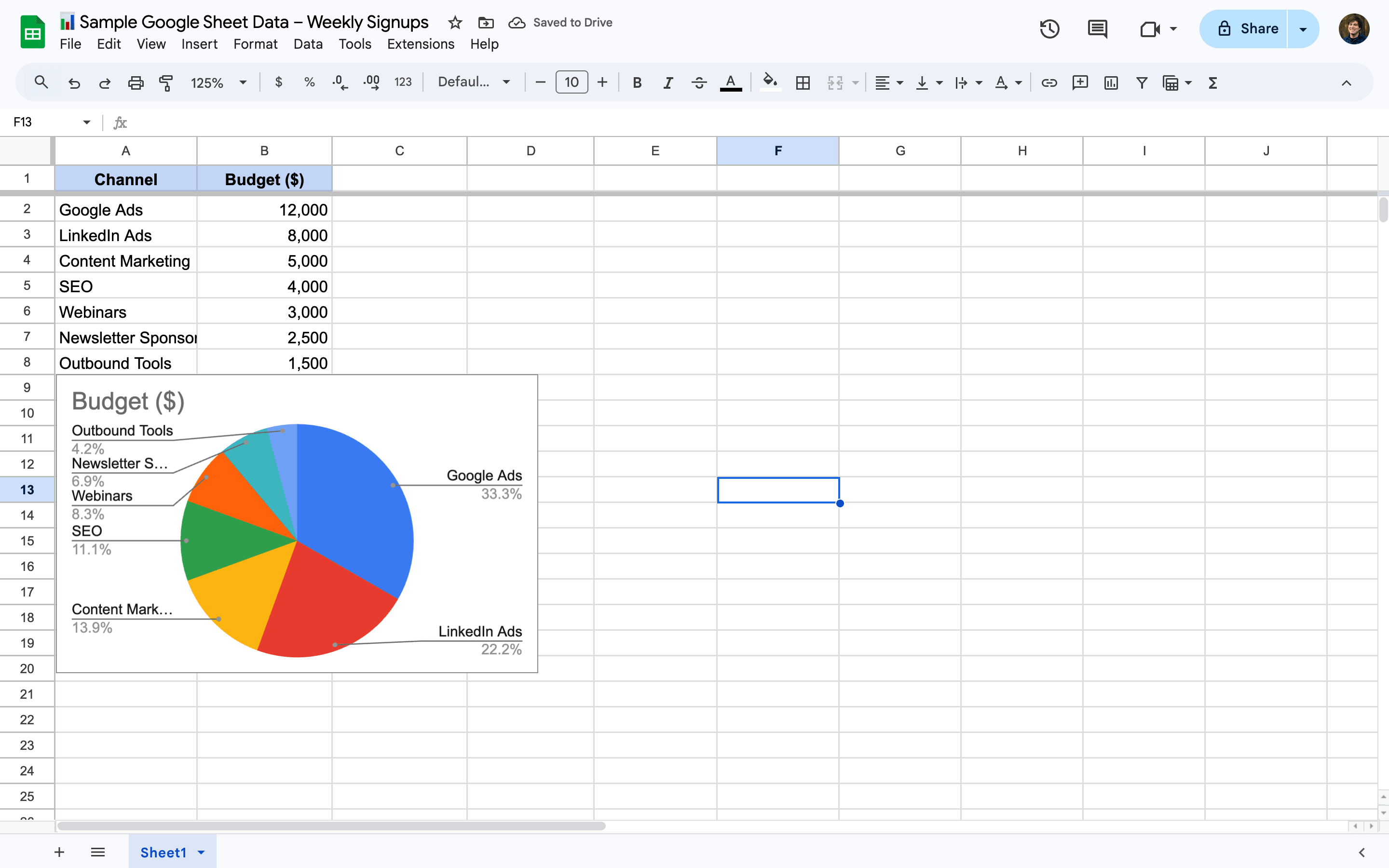
1. Select Your Data in Google Sheets
Open your Google Sheets file and highlight the two columns needed: one with labels (like product names) and one with corresponding values (like sales totals).
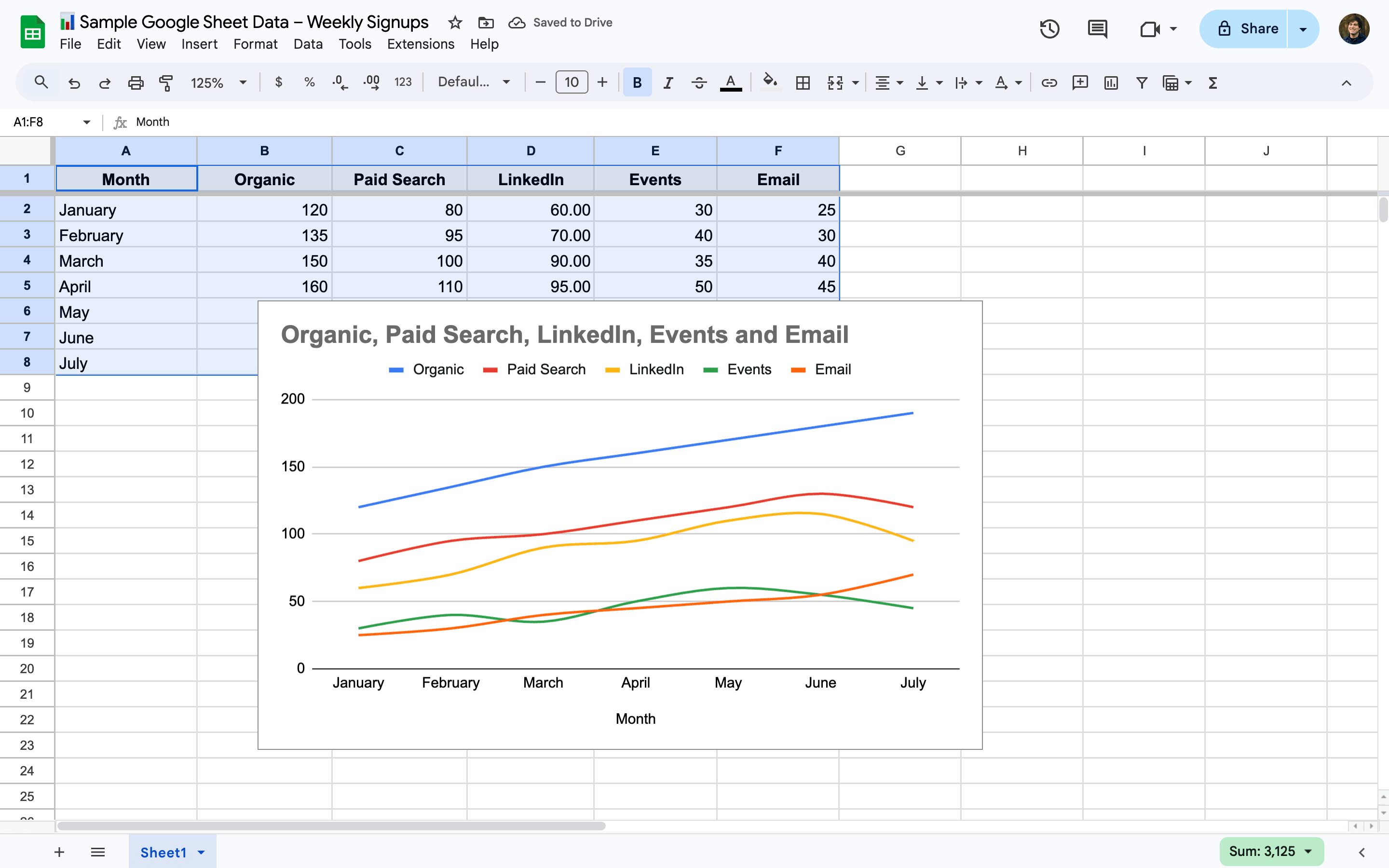
2. Click Insert and Then Chart
From the top menu, click Insert and choose Chart. A default chart type will appear, often a column chart.
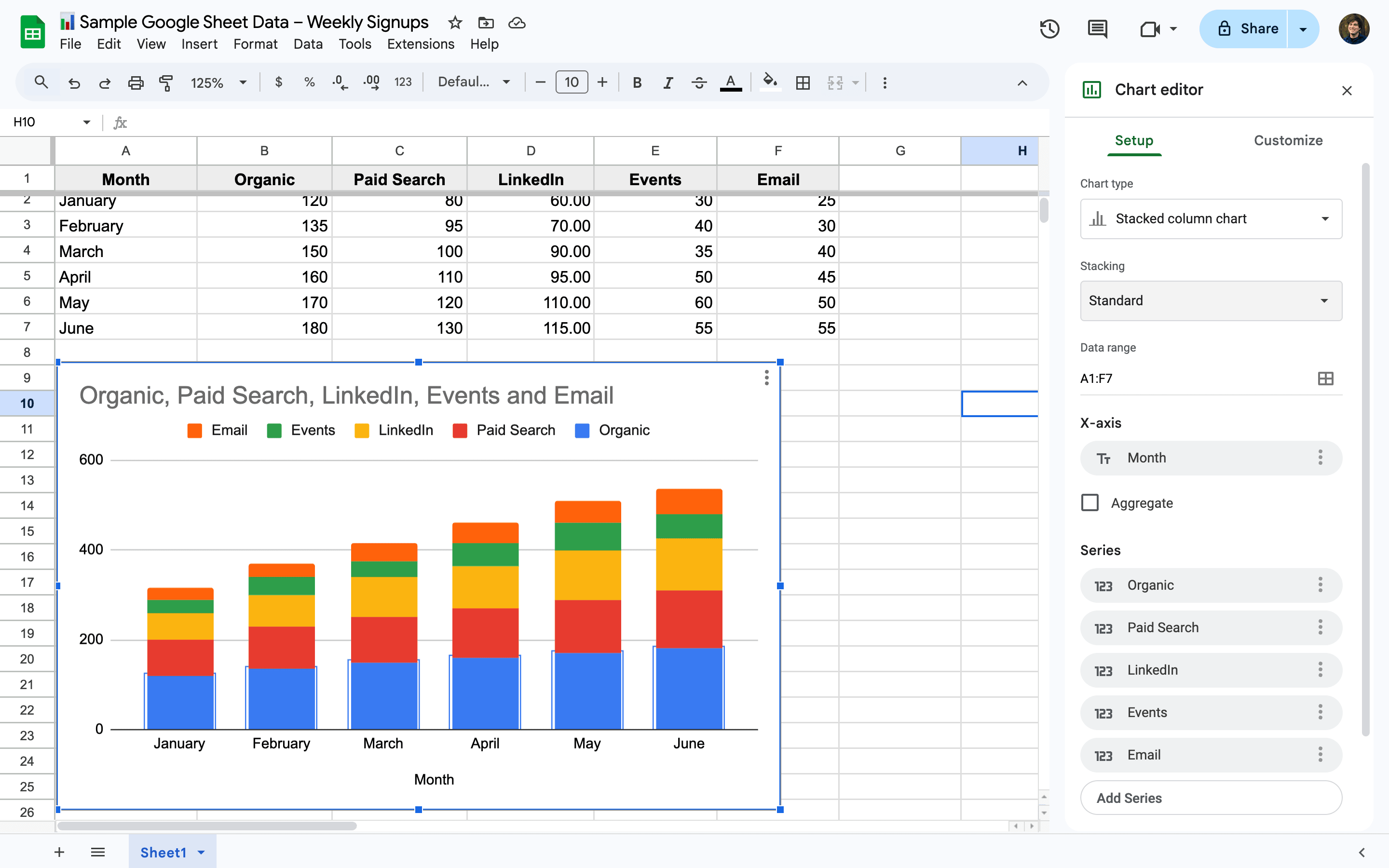
3. Change the Chart Type to Pie Chart
In the Chart Editor on the right, go to the Setup tab and click the Chart type dropdown. Select Pie chart or explore options like 3D pie and donut chart.
4. Verify Your Data Range and Labels
Make sure the Data range and Label fields in the Chart Editor are accurate. Google Sheets usually detects this automatically, but it’s worth double-checking.
5. Customize Your Pie Chart’s Appearance
Under the Customize tab, tweak the chart’s colors, labels, and legend. You can also add slice labels to display percentages or actual values.
6. Resize or Reposition the Chart as Needed
Click and drag your pie chart to move it around the sheet, or use the corner handles to resize for a cleaner layout.