1. Open your Google Sheet and select your data
In Google Sheets, highlight the cells containing your labels and values. For a line graph, your x-axis (e.g. dates or categories) should go in the first column, and numeric data (e.g. revenue, conversions) in the next.
2. Click the Insert menu and choose Chart
Go to the top menu bar, click Insert, then select Chart. Sheets will automatically suggest a chart type based on your data.
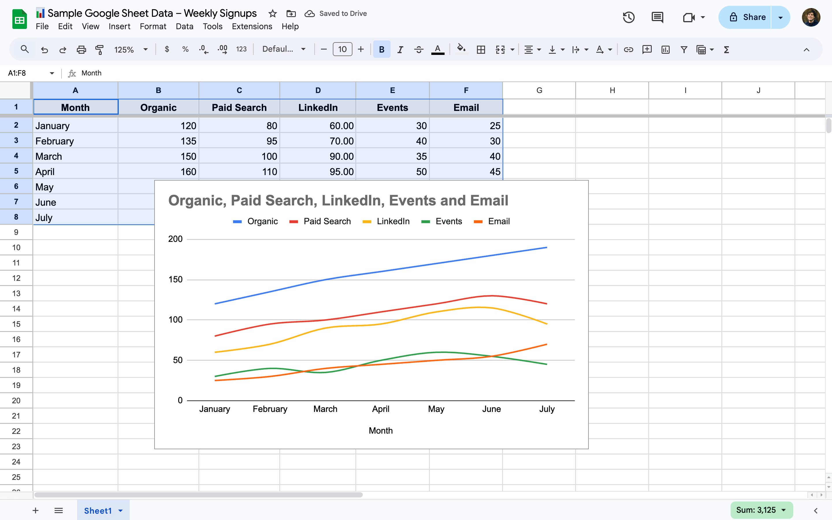
3. Change the Chart type to Line chart
In the Chart Editor sidebar on the right, go to the Setup tab and click the Chart type dropdown. Select Line chart from the list of options.
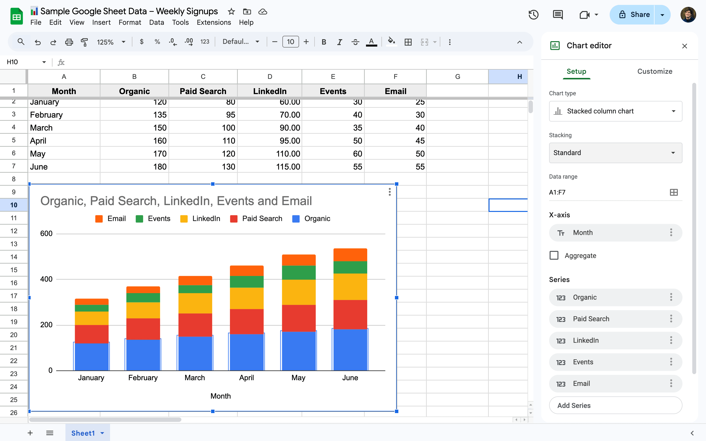
4. Adjust your chart range or series if needed
Still in the Chart Editor, confirm your Data range and Series are correct. You can add or remove series manually if the wrong data was selected.
5. Customize labels, colors, and lines under the Customize tab
Switch to the Customize tab to style your chart. You can adjust axis titles, line colors, point shapes, and more under sections like Chart & axis titles, Series, and Gridlines.
6. Move or resize your line graph on the sheet
Click and drag your chart to reposition it, or pull the corners to resize. This is helpful when aligning the graph with your data or layout.